A New Look For Our ‘Know It All Buddy’ – Google

At the time when ‘Google it’ had become our favourite go-to phrase, our internet buddy, the one who answers even our slightest of doubts in seconds is getting a new look. Yes, Google is rolling out it’s updated look on search result page in desktop. Even though the same changes were made last year in mobile search results, they are implementing it on desktop too.
Google has brought changes in looks of organic and paid search results on the desktop version. Let’s dig deeper and get to know more about it.
What is organic and paid search results?
Paid search results are the few search results that appear at the top of the page as these are the ads that are paid by businesses to rise above other links. They pop up as search engine relates it with your query. Organic search results are the natural ones. They appear below the paid search results. These search results pop up based on the quality and quantity of the content, and it can be trusted too. Organic search results most probably contain more relevant content related to your query. This also takes much time to climb up the ladder in the search result page.
The old version
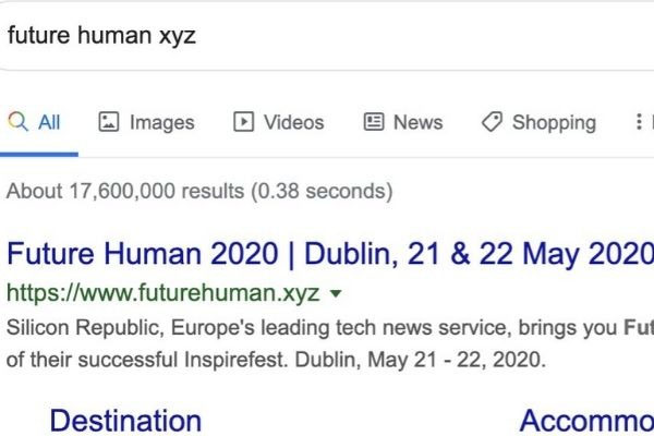
Now it’s time to put your observing skills in test. If you can remember the last time you searched something on the desktop then take a mind screenshot of the result page, you will probably get to see the bigger picture. The previous version of paid search results had bold ‘Ad’ labelled in green text, and their URL was in green too. It was in the year 2017 when they introduced the green colour label. Here is a picture of our old Google search page:

The updated version
The updated version has a more prominent ‘Ad’ label for paid results. In this, the paid search results will have bolded ‘Ad’ label in black text. Google also removed the URL above the headline text and styled in black. When it comes to organic search results, they included favicon that is web icons beside the URLs, which gives the site owners the advantage of optimization on and also changed the green text to black. They removed the grey line below organic titles and Ad headlines. Google made the announcement through the Twitter and here is how the updated version look like;
Last year, our search results on mobile gained a new look. That’s now rolling out to desktop results this week, presenting site domain names and brand icons prominently, along with a bolded “Ad” label for ads. Here’s a mockup: pic.twitter.com/aM9UAbSKtv
— Google SearchLiaison (@searchliaison) January 13, 2020
Well, it will take some time for the searchers to get used to this new design. However, Google has 3.5 billion searches per day, and I don’t think it will be a big issue. What do you think of this new update by Google?


